Hello friends!
I'm Sam Scislowicz 👋
I'm a Product Designer with a passion for solving problems and creating delightful experiences. While a lot of my recent work can't be shown publicly yet, I wanted to give you a sneak peak into my latest project to show you my design process. ✨
Background
Butterfly.ai specializes in Management coaching from employee feedback. With just a simple bi-weekly or monthly surveys Butterfly.ai shows you anonymized data so you can better understand what skills to work on. Butterfly Assistant was made to take that data, and give you content (an article or video from a workplace professional) based on your weaknesses, so you can learn to be the best leader possible.
I joined the team as Butterfly Assistant was already in beta. So I started this project by doing User Research and User Testing of the beta version.
Team: Product Manager: Anthony Citron
- Project Manager: Sarah Chiche
- Engineering and Customer Service Teams 🙏
My Role: Lead Product Designer
(Beta screenshots below)

Butterfly Assistant Beta
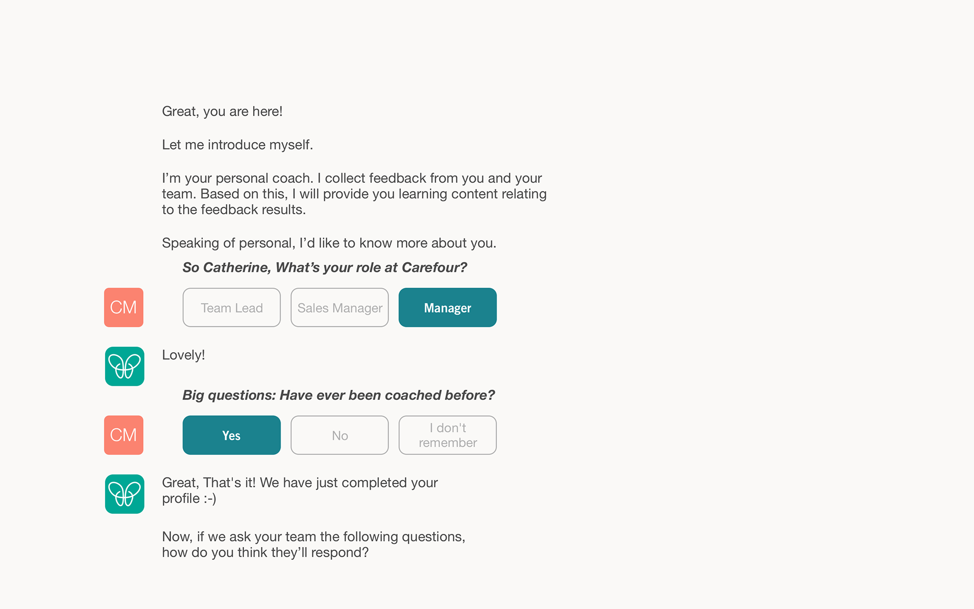
Butterfly Assistant On-boarding
Problems
The first problem I found through my User Research was that the on-boarding process was too long and confusing, which lead to over half the users not completing the conversation, and not reading or watching the content we sent them.
This meant our content delivery system was giving users uninteresting articles, during an inconvenient time of their day, that wasn't helping them become leaders.

Brainstorming solutions after listing all problems

How might we achieve our solutions? Brainstorm session
Challenges
After we spent a lot of time brainstorming for solutions, it was clear we needed to adjust the entire conversation to be more interesting, fun, and most importantly, human. Along with making sure Butterfly Assistant embodied traits that were important to the user, we also needed to make sure that we sent the content at the best time for the user.
After mapping out Butterfly Assistant's current conversation, I was able to shorten the conversation by removing unnecessary questions and messages, and change the voice of the messages to sound more like the traits we wanted Butterfly to have.
Then I included questions in the on-boarding to allow the user to change the time of arrival for their results, and included a reminder for the user if they selected that they couldn't view the content at that time.
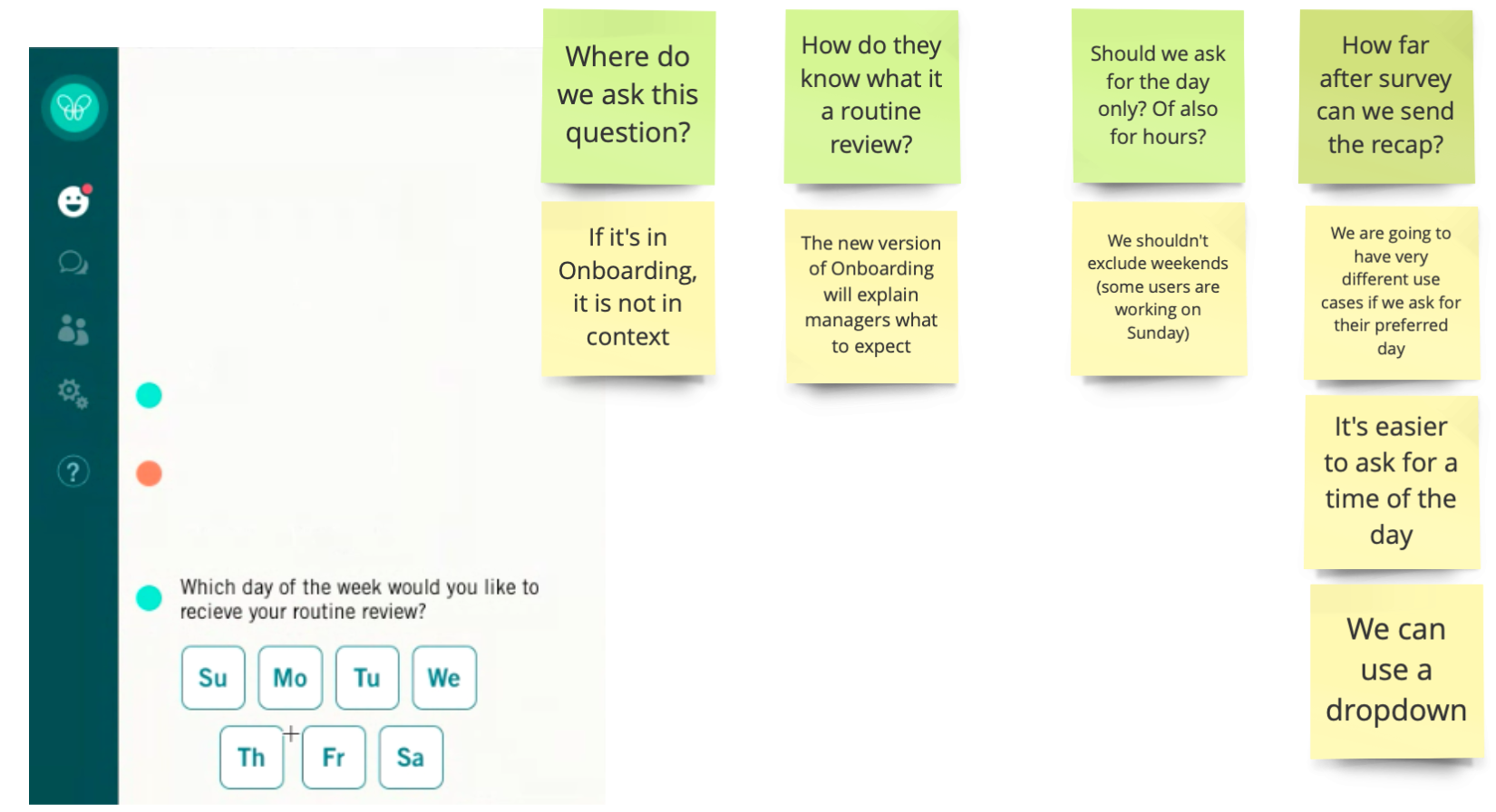
Designing a better way to send content at the best time.

Designing a better way to send content at the best time.
Our hypothesis was that by making these changes the user would, of course, read the content more often then see an improvement in their Butterfly survey results directly.
This was not the case.

Map of Butterfly Assistants new conversation

Conversational flow with edge cases for Butterfly Assistant
After making these changes and testing with our users, we only saw a 4% increase in conversation completion. It was clear that we needed to make a major adjustment to Assistant's experience to get our users engaged. Then I spent a lot of time researching our competitors and other chat bots to see what was and wasn't working for them. This lead us to our next solution.
Solution
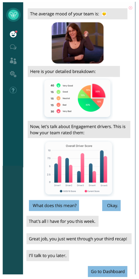
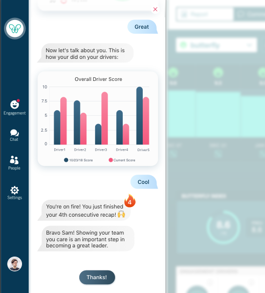
Introducing Smart Recap and Actions:
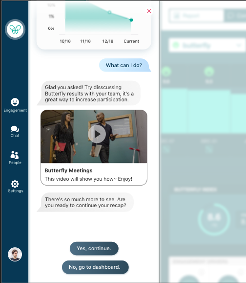
After extensive user testing I found out how boring it was to see the recap again and again. Not just personally, but our users found this too. This was because Butterfly Assistant was reporting your survey results in the same wording and the same exact order every time you had new results. This meant that the conversation needed to be smarter, and adapt to your needs. It shouldn't just tell you what you can see on your dashboard, it should analyze and prioritize your survey results. But that's not all.
Butterfly Assistant also needed to give the user an actionable way to fix any urgent matters, for example, a comment from an unhappy employee. And award managers that complete the actions, this would incentivize the manager to be an engaged user with Butterfly Assistant.
So we built our Smart Recap and Action features to fix this. For these features we first created an action hierarchy to tell Butterfly Assistant what was most important, and how to tell the user to fix it. After the user asked how to complete the action, Butterfly Assistant would automatically open the pages needed for the user to complete the action. Truly helping the manager from end to end of the entire experience.

The beginning of our action hierarchy
Next I started the low fidelity designs and wireframes for the new UI, making it more modern, clean, and accessible. Along with the new awards and animations to make Assistant a delightful experience.

Wireframes
Second wireframes

1st designs
Which lead to the high fidelity designs:

My Process

Final Demo
I created this prototype using Principle:
Going Forward
Going forward we will have regular user testing on the product to continually improve Butterfly Assistant.
The new style and design of Assistant will also be adapted for our Dashboard product in the coming year.

